The Future of Web Development: Amplify UI's Advanced Features and Ecosystem

Introduction
The Amplify UI library is a powerful tool for building user interfaces for web applications. It is built with plain React and CSS, providing a solid foundation for building UIs and design systems. The library consists of connected components that simplify complex workflows like authentication and dynamic data, primitive components that form the building blocks of a UI, and themes to make Amplify UI fit any brand. The library is themeable, responsive, composable, and accessible. And on top of it all it also plays nicely with other UI components or styling frameworks.
Connected Components
This is by far the coolest feature of the framework. The connected components in Amplify UI are pre-built, reusable components that handle common workflows like authentication and account management with AWS Cognito or file uploads to your AWS S3 buckets. These components handle the heavy lifting, allowing developers to focus on building the unique features of their application. By using these connected components, developers can easily add features like user sign-up and sign-in, password recovery, and data storage and retrieval. With the Authenticator component, developers can add authentication to their app in under 10 lines of code. The Authenticator works seamlessly with the Amplify CLI to automatically work with your backend, no extra configuration needed!
import { Amplify } from 'aws-amplify';

import { Authenticator } from '@aws-amplify/ui-react';
import awsExports from './aws-exports';
Amplify.configure(awsExports);

<Authenticator>
  {({ signOut, user }) => (
    <main>
      <h1>Logged in as: {user.username}</h1>
      <button onClick={signOut}>Log out</button>
    </main>
  )}
</Authenticator>
You can add a file uploader component and save time building a full-stack application:
import { FileUploader } from '@aws-amplify/ui-react';

<FileUploader
  acceptedFileTypes={['image/*']}
  accessLevel="public"
/>
Amplify UI has most components built for ReactJS but you can find components like the Authenticator also implemented for Angular, React-Native, Vue and Flutter. You can learn more about cloud connected components in the official documentation.
Primitive Components
In addition to the connected components, Amplify UI also provides a set of primitive components that form the building blocks of the UI. These components include buttons, forms, inputs, and other common UI elements. These components are designed to be flexible and customizable, allowing developers to create a unique look and feel for their application. The primitive components can be easily styled to match a specific brand or design system.
import { Flex, Text, TextField, Button } from '@aws-amplify/ui-react';
<Flex
  direction="row"
  justifyContent="flex-start"
  alignItems="stretch"
  alignContent="flex-start"
  wrap="nowrap"
  gap="1rem"
>
  <Text
    variation="primary"
    as="p"
    color="blue"
    lineHeight="1.5em"
    fontWeight={400}
    fontSize="1em"
    fontStyle="normal"
    textDecoration="none"
    width="30vw"
  >
      Hello World!
  </Text>
  <TextField
    descriptiveText="Enter a valid last name"
    label="Last name"
    errorMessage="There is an error"
  />
  <Button
    variation="primary"
    loadingText=""
    onClick={() => alert('hello')}
    ariaLabel=""
  >
    Click me!
  </Button>
</Flex>
You can learn more about Amplify UI components in the official documentation.
Customization
Customize every detail of the authentication flow with themes, overrides, or bring your own UI with a headless mode. Create a unique look-and-feel for your application in minutes. Amplify UI uses design tokens and plain CSS so every detail can be customized. Dynamic theming for dark mode, responsive, and user preferences is easy with theme overrides.
In order to theme your components you just need to wrap your app in <ThemeProvider/> component, and all child elements will inherit the theme values:
import { ThemeProvider } from '@aws-amplify/ui-react';

const App = (
  <ThemeProvider>
    <MyApp>/* AmplifyUI */</MyApp>
  </ThemeProvider>
);
To override the default theme values, like primary colors, border colors, spacing values, border radius, font weights, you can provide via your own theme object:
import { ThemeProvider, defaultTheme } from '@aws-amplify/ui-react';

const customTheme = {
  name: 'my-theme',
  overrides: [
    {
      colorMode: 'light',
      tokens: {
        colors: {
          neutral: {
            10: { value: defaultTheme.tokens.colors.neutral[100].value }
          },
        },
      },
    }
  ],
};
const App = (
  <ThemeProvider theme={customTheme}>
    <MyApp>AmplifyUI</MyApp>
  </ThemeProvider>
);
You can also override the theme values in CSS with overriding classes or global variables:
/* single element style */
.amplify-alert {
  border-radius: 100px;
}
/* global styles */
:root, [data-amplify-theme] {
  --amplify-primary-color: #333;
}
You can learn more about Amplify UI themes in the official documentation.
Amplify Studio
With Amplify Studio, and specifically the new UI Library, developers can design components in Figma, bind them to their data, and generate production-ready React code. Go from design to production-ready code in minutes and eliminate the design-development gap.
The setup is extremely easy! Just link your Figma file to Amplify Studio, and watch your Figma components be converted into ReactJS components.
The Amplify Studio feature allows for visual data binding, event handling, and working with collections of repeating items. This allows for efficient building of interactive components and simplifies the process of mapping fields to backend data models, automatically including all data bindings in generated code.
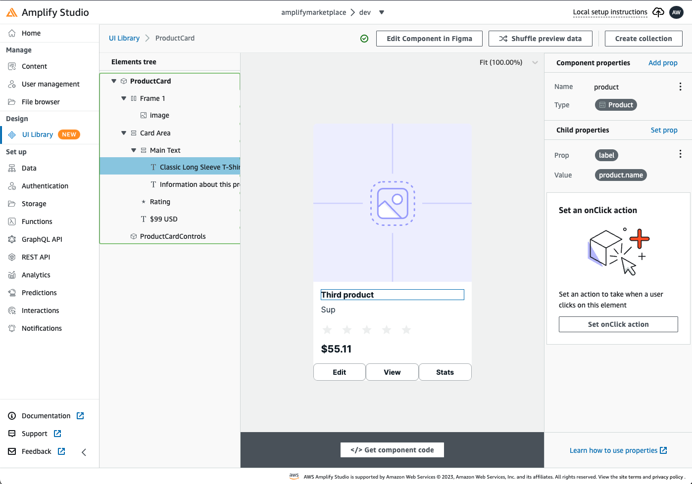
For example you can connect your ProductCard Figma components to your Product data model:
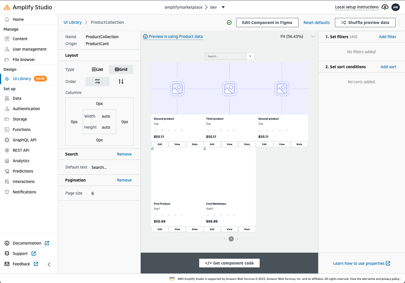
You can even create a filtered and paginated collection of ProductCard elements:
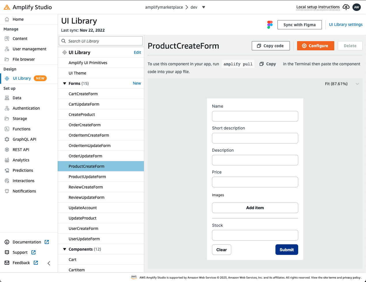
But there is more! Amplify Studio lets you generate form elements that you can integrate into your application in order to create or update your Data models:
The Amplify Studio UI Library tool, which is an integral part of the Amplify UI framework, is undergoing constant development and improvement. As the ecosystem of tools and services expands, it is becoming increasingly easier to quickly create cloud-connected applications using Design-to-code solutions, as well as access professionally designed Figma Amplify UI templates to speed up the process of building visually appealing web applications.
Conclusion
In conclusion, Amplify UI is a powerful framework for building web user interfaces. It simplifies complex workflows by providing pre-built, reusable cloud connected components, and provides a flexible, responsive and customizable framework for building UI with primitive components. Additionally, the themes system allows developers to easily match the look and feel of their application to their brand. Amplify UI is a great choice for developers looking to quickly and easily build high-quality web applications, with the added benefits of Amplify Studio and Amplify Libraries. The framework is built with accessibility and developer experience in mind, making it a complete solution for building web applications.
PS. Need to quickly lookup AWS Amplify CLI command or code snippet? Checkout the all-inclusive AWS Amplify cheat sheet!